This month saw the launch of the second book in V E Schwab's Shades of Magic series. The book was released in the UK and the US simultaneously – and each region opted for a different cover. Lets take a look:
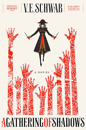
US Edition - Design by Will Staehle
The map printed in red used to form the upreaching arms creates striking imagery as a lone figure in black (who fans of the series will recognise Delilah Bard) hovers above them. The design looks minimalistic at first glance and works well as a thumbnail. Those looking at a larger image are rewarded by the intricate detail of the map and see that the cover artist has managed to squeeze in two reviews (either side of the author's name) and the oddly superfluous explanation that this is 'A Novel'. The designer uses the two-color design to maximum effect with the book's title. By alternating the colors of the words, the spacing between characters are reduced, allowing the title of the book to fit onto a single line without feeling squashed.
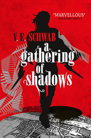
UK Edition - Design by Julia Lloyd
The UK edition features a bold siluoutte of the protagonist which is less cartoon-like than that US edition. The character's windswept look, combined with the red background convey an urgency - something is about to happen and it is not going to be good. The title of the book takes center-stage, with the designer making good use of contrasting colors to avoid having to use drop shadows. The typeface is flamboyant, with flourishes that hint at forked tongues. The series focuses on several parallel versions of London, and we see Grey, White and Red London maps being disrupted by Black London crashing through. This detail gives a hint of what is happening in the story to those familiar with the series, but is subtle enough so as not to leave newcomers feeling confused about the imagery.
So, which do you prefer, the US or the UK edition? Share your thoughts in the comments section below:


