Every now and again we take time to compare covers from the UK and the US. Last time we we looked at V.E. Schwab's book A Gathering of Shadows. This time we have a bumper collection for you. In all cases the US versions are on the left. Share your analysis in the comments.
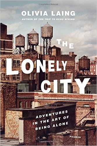
The US cover manages to be complex yet stark all at the same time. The detailed cityscape is beautifully mirrored by the typesetting with letters mimicking the differing heights of the water towers and aligning to the straight lines of the buildings. The UK version uses closed, white blinds to emphasize loneliness. Whilst it is not as clever as the US version it has the desired effect. The Lonely City: Adventures in the art of being alone was released March 1, 2016.
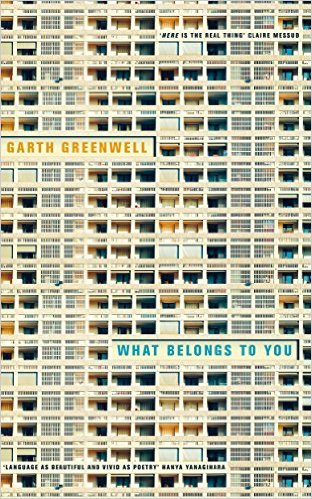
This time the UK version wins it for me. Increasingly cover designers (myself included) are designing book covers in the knowledge that the first time the reader sees it is going to be in a thumbnail on Amazon. It's why you see so many books these days with BIG TEXT COVERING MOST OF THE PAGE. Both artists here have used have gone with a similar theme, and while the US cover is more thumbnail-friendly, the UK version does a great job of drawing the reader in. The color of the text bends in well with the building behind it and, while the text is illegible when viewed as a thumbnail, the reader-in-waiting is compelled to click on image to explore it in more detail. What Belongs To You was published in January 2016.
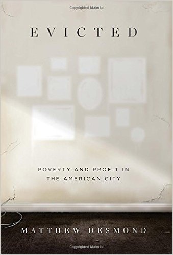
The US cover really touches a nerve. The shadows of recently removed pictures talk at a deeply human level. We can easily imagine families being wrenched from buildings that had been their homes and are left wondering what became of them. The UK cover artist was limited as they had to make reference to the focus of the book being eviction in America. While the use of a moving box is clever, it is left to the reviewer to inform the reader of the "harrowing and deeply human content" within. Evicted was released on 1 March 2016.
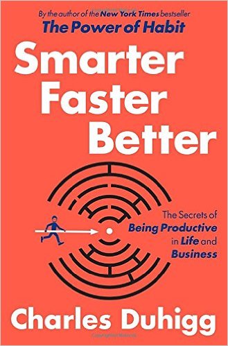
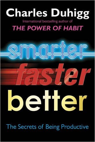
It's not just fiction books that differ from market to market – I'll leave you with a non-fiction book. The UK version refers to the book being an international bestseller, while the US version highlights its New York Times bestseller list credentials. The US version mixes metaphors beautifully, combining finding a way through a maze with hitting the target with a giant arrow. In the UK version, the typography itself tells the story – neon/electric smartness, super-fast drop shadows and the hint of riches when you unlock the secrets of productivity. I'm not sure which style I prefer, but I'll take an orange background over black any day. It feels more modern and fresh. Smarter Better Faster: The Secrets of Being Productive was released on 8th March 2016.
Which did you prefer? Join the discussion in the comments below.
